

For almost two decades the Eurovision Song Contest has been having a logo which changes with every edition of the contest. This year’s edition is no different. The EBU revealed the new design for the logo of the upcoming contest in Rotterdam which is due in May.
Designed by CLEVER°FRANKE, the logo symbolizes all of the artists coming together to Rotterdam, the city all eyes will be looking at this year. The design team was joined by MediaMonks and NEP which will make the artwork available for use on many platforms from websites to marchendise and even public transport. The palette used to design the logo remains the same as in 2020 and consists of the colors of the participating countries’ flags in addition to bright green, pink and purple.

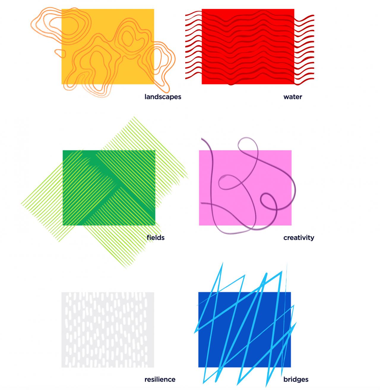
In addition, the logo’s patterns were all inspired by The Netherlands and 6 keywords which symbolize it the most: landscapes, water, bridges, fields, creativity and resilience. The patterns can be found in the background or in the beams of the logo. The beams were inspired by last year’s stage designed by Florian Weiber.
The logo itself is flexible as it can be moved and modified in many ways as long as it keeps its rhombus shape.
What do you think of the new logo? Share your thoughts with us in the comments!